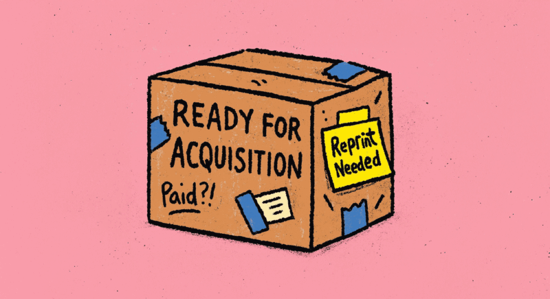
So, you’re thinking about selling one day.
Maybe not tomorrow, but… soon-ish.
Maybe a tidy strategic acquisition. A gentle earn-out. Time to finally write that cookbook, or disappear to Devon.
Lovely.
But here’s the thing. Most founders, even the brilliant ones, spend years obsessing over the product, the story, the numbers… and almost zero time thinking about what their packaging is saying to a buyer.
And it says a lot.
Here’s how some of the UK’s most recognisable challenger brands got it right (and wrong), and why your packaging might be quietly making or breaking your future deal.
“We’re ready” isn’t something you say. It’s something you show.
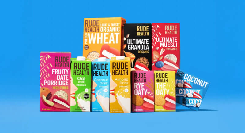
In October 2024, Rude Health, the colourful, plant-based brand loved by oat milk drinkers and Waitrose, was acquired by Finnish food giant Oddlygood.
The press release said all the usual grown-up things:
“Joining forces with Oddlygood opens up new opportunities for growth and innovation, and our shared missions around taste, quality and the crucial role of plant-based food and drink make this a natural fit.”
Tim Smith, CEO, Rude Health
But look closely and you’ll see this wasn’t just a values match.
It was a readiness match.
Rude Health had:
- Recyclable packaging across formats
- Clear, consistent messaging (from shelf-edge to shipping box)
- Scalable SKUs with strong brand equity
- Print-ready assets that didn’t need an agency to decipher
The takeaway? If your buyer has to unravel your formats, fix your barcodes, or redesign your tray artwork, they’ll either lower the offer or walk away.
Acquirers hate packaging “surprises”
Imagine you’re a buyer at a major retailer or food group. You’ve seen the pitch. The product is clever. The founder’s nailed their numbers. You’re nodding along…
Then the packaging lands on your desk, and you feel your eye start to twitch.
The logo’s different on every SKU. The pack doesn’t explain what the product actually is. Shelf life text is barely visible. The finish is inconsistent. One SKU even has an old awards badge from 2021 still hanging on like a house guest that won’t leave.
It happens more often than you think.
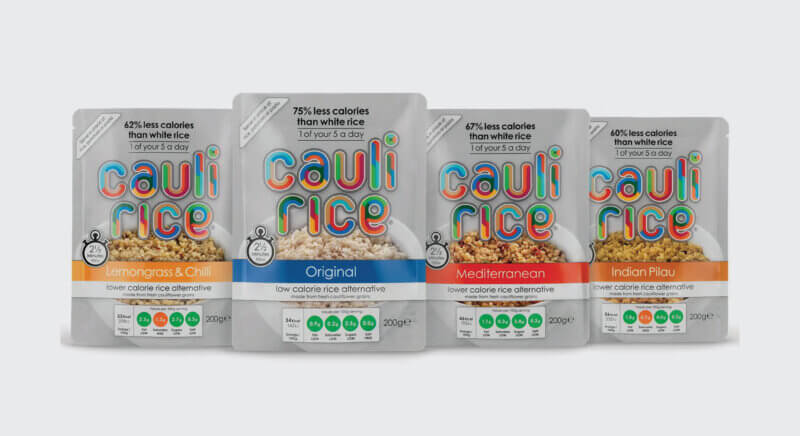
Take Cauli Rice, for example. Now known as Fullgreen, the brand had a strong product story, ready-to-eat, low-carb cauliflower rice in pouches. They got big early wins, including retail listings and investment on Dragons’ Den.
But in the late 2010s, buyers and commentators flagged a key problem: no one really knew what it was. Was it a meal? A side? A snack? A health food?
“We couldn’t tell if it was a meal, a side, or a base for something else. The packaging didn’t help.”
Former UK grocery buyer, quoted anonymously in The Grocer, 2020
The product was smart. But the pack confused. It didn’t tell a clear story. The visual identity lacked consistency. Messaging shifted between SKUs. And in fast-moving retail categories, that creates hesitation, both from buyers and customers.
Since then, the brand has restructured, rebranded, and sharpened its range. But those early years show how even good products can falter when packaging fails to support the brand’s ambition.
The takeaway?
Confusion costs listings. It costs investor confidence. It might even cost you the deal. Packaging that makes buyers pause is packaging that needs work, before you’re in the room.
Print choices that help close deals
If you’re on the road to acquisition, don’t wait for a buyer to tell you your pack needs work. Here are things they’re already looking at:
✔ Scalable formats
Can your SKUs flex across DTC, retail and export? Or are you locked into awkward margins and minimums?
✔ Retail-proof messaging
Can your product sell itself at shelf without you standing beside it with a tray and a hopeful smile?
✔ Sustainability clarity
Not vague green buzzwords, real reductions, clear labels, recognised certifications.
✔ Cohesive brand world
From pouch to shipper box, does everything feel part of the same family?
✔ Supplier-ready files
Do you have tidy, organised, print-ready artwork or are you hoping your designer replies to a panicked WhatsApp at 10pm?
Print = margin. And margin = offer.
During due diligence, your buyer will look at cost per unit.
But what they’re really asking is:
Can we scale this without bleeding margin?
If your current packaging involves:
- overcomplicated finishes
- high MOQs
- multiple suppliers
- or waste-heavy formats
…you’re gifting them a red flag.
Not only will it cost more to run, it’ll cost more to fix. And big companies hate fixing things that should have been sorted years ago.
Final thought over tea
If you’re aiming to sell your business, whether it’s this year or next, don’t just think like a founder. Think like your future buyer.
Ask yourself:
- Does our packaging prove we’re serious?
- Does it sell the product and the business?
- Does it create confidence, or questions?
Because when the right acquirer comes along, you want your pack to be the thing that seals the deal, not something that makes them pause.
Need a second opinion?
We help food and drink brands review and refine their packaging to make sure it’s not just beautiful, but buyer-proof.
Let’s talk about packaging that sells your product and your business.
